Visual identity for DOU donuts
DOU donuts began in 2019 in a home kitchen and grew into a brand run from a cloud kitchen serving several regions of the Kingdom. That stage called for an identity that conveys both the playfulness and the authenticity of the product, so the brand was built on a bold wordmark, an approachable personality and a sunrise-inspired colour range, then applied to boxes, packaging and posts.
 Identity · Packaging
The idea
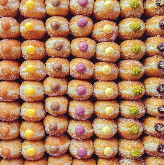
The brand stands on one clear product: the bite-sized filled donut, a light dough coated in sugar, zaatar or biscuit flavours, with a filling that changes with taste. It states that foundation in a short line that joins local belonging and authenticity: “Saudi quality, and the donuts are the real thing.”
Operationally, the brand moved from home cooking to a cloud kitchen, so both the business model and the identity rest on reaching several regions without depending on a single location. That made the packaging the guest’s first encounter with the brand.
Name and logo
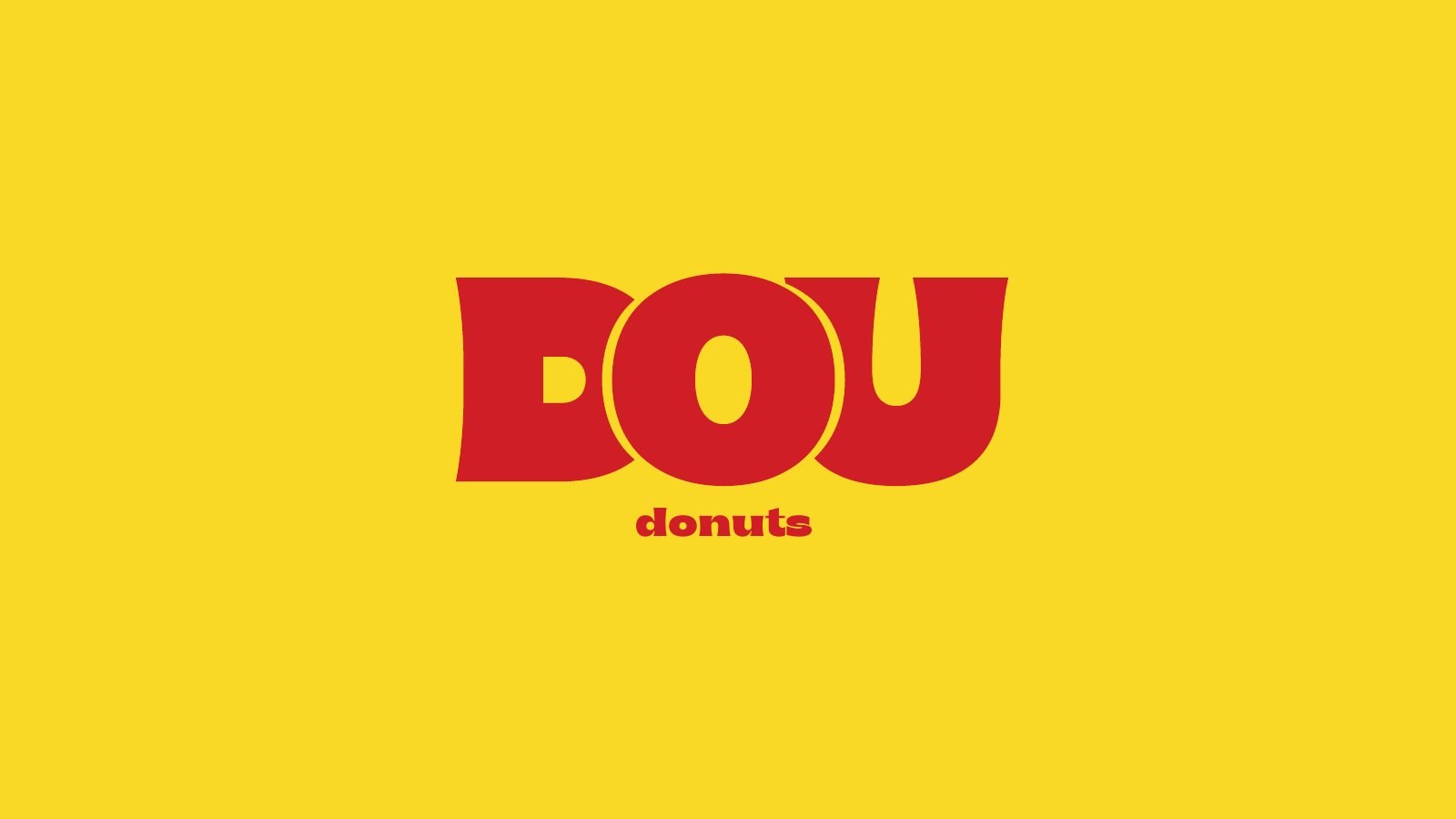
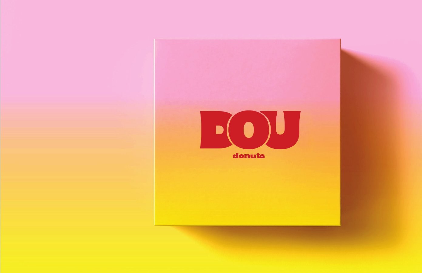
“DOU” comes from the English word dough, the product’s main ingredient. The name therefore leaves room to grow beyond donuts if the brand expands into other dough-based products. The logo is a wordmark in heavy, full letters in which the O overlaps its neighbours with a thin outline that echoes the shape of a donut, with the descriptor “donuts” set beneath in smaller type.
Personality and tone
The brand’s personality is youthful and playful, open to new experiences, equally at home with family gatherings and office ones, and built on honesty, trust and lightness. The tone is friendly and indirect in addressing the guest, using Arabic seasoned with a few colloquial words and a little English, and speaking in the spirit of a likeable character who knows what makes the customer laugh and what makes them happy.
Colour
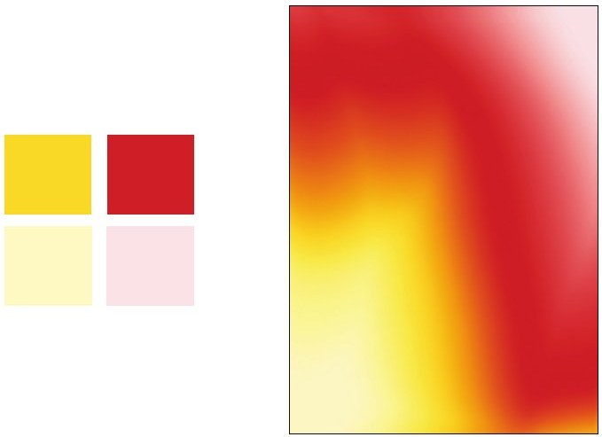
The identity adopts a “sunrise” range: a gradient between red and yellow with two soft tints of cream and pink. Red is the primary colour and signals enthusiasm and excitement, yellow carries joy and warmth, and the two soft tints give supporting surfaces a gentleness that suits a sweet product. The same gradient serves as background for packaging and product photography.
Boxes and packaging
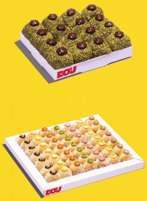
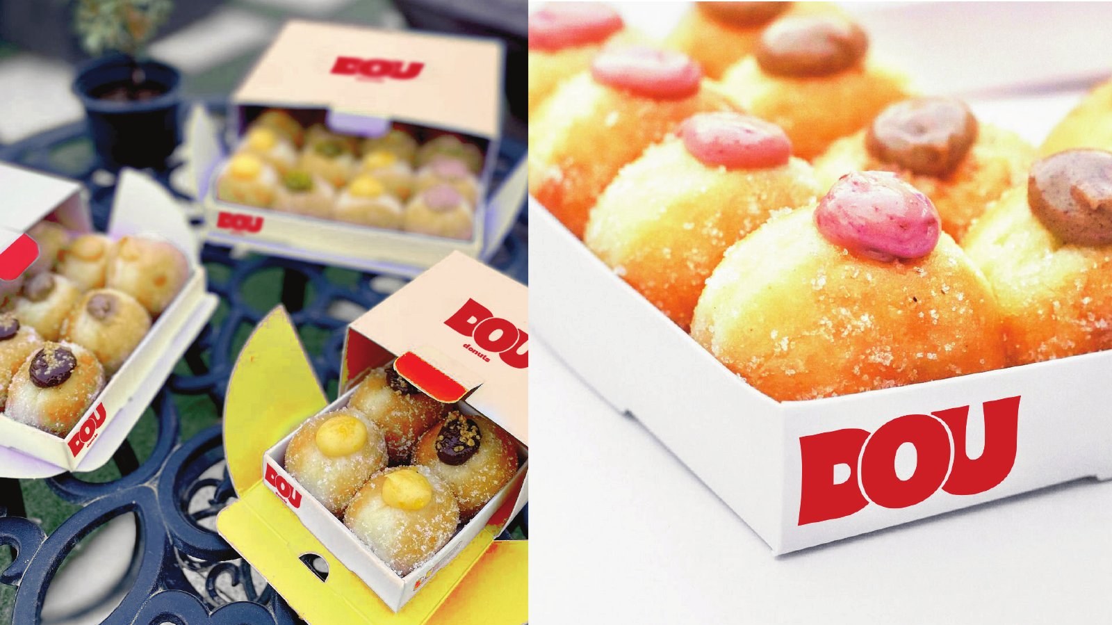
The box system serves both small groups and large occasions, with three options ranging from ten to forty pieces, in a contemporary, practical design suited to private events, workplaces and family gatherings. The red logo sits on a plain white box that lets the donuts stand out, while the sunrise gradient is used on the higher-impact boxes.
Posts and social media
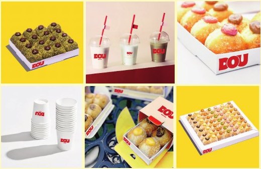
The post guidelines call for clean, modern imagery in which the taste of the product comes through in the scene itself, so followers feel a continuous journey between the profile and the posts, focused on everyday life in the local community. Yellow surfaces are combined with close-up shots of fillings and boxes to keep the grid consistent.
What this means for your brand
A brand that moves from a home kitchen to a model serving several regions has to stay familiar on every box and in every post, even if the guest never visits a single location. That is why the work started from the idea, the name and the personality before any logo was drawn, and the colour, packaging and posts were built on them. If you are launching a food product or turning a small beginning into a brand, the concept is what keeps everything that follows consistent.
The idea, concept and creative direction are by House of Idea, led by Mohammed Alhasoon. The visual identity and the presentation were produced by the ThirtyThree Media team.

Launching a food product or turning a project into a brand?Start with Concept Building: a document that settles the idea, name and personality before any design is commissioned.
Concept Building →