Building the concept and identity of Flave, a creative bureau for events and entertainment
Flave was conceived as a creative bureau that brings events, brand management and entertainment under one name. The concept is built on the idea of “some of everything”, with a bold visual identity that pairs a logo drawn from the smiley face with fluid, liquid-metal gradients, and applications ranging from stationery to stickers and print.
 Concept · Identity
The idea
Flave presents itself as a new form of brand management and an entertainment hub, meeting market needs from events through to brand building. The concept rests on a philosophy of “some of everything”: giving each part of the work its due, and building something from nothing, whether a brand, an entertainment experience or a concept. In that sense it gathers the pieces of the picture on behalf of its client.
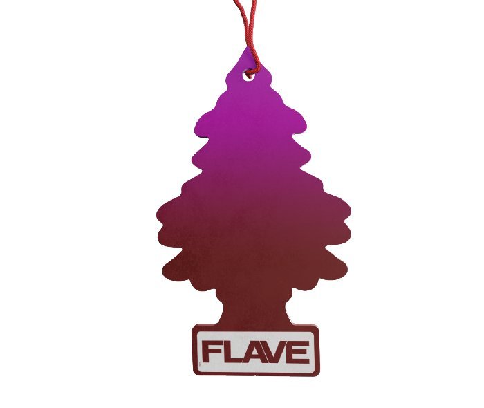
The brand chose a feeling that is strong, bold and timeless, backed by research, a clear philosophy and strict working standards. This shows up in a visual approach that borrows familiar, well-loved references from popular culture and recombines them with nerve and a sense of humour.

Name and logo
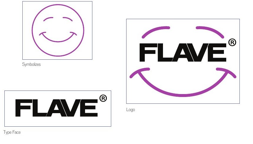
The logo has two complementary parts. The first is a smiley face, a primal drawing that stands for simplicity and human feeling, deconstructed into separate arcs around the name to carry the brand’s raw spirit. The second is the word “Flave” in a heavy, strong typeface, representing the power the brand supports and is built on. The mark therefore reads as a smile and a word at once, and the smiley can also stand alone as a symbol on seals and stickers.
Colour and type
The palette is built on indigo with a light sky blue, set against orange and pink, plus two cool greys for balance. Large surfaces are built from fluid gradients that look like molten metal, shifting between acid green, pink, violet and blue, giving the identity a motion and shine that set it apart in its sector.
The identity uses a light, wide-set Latin typeface as its main font, OPTI Venus, a secondary Latin face of a different character, Greca, and Ahaleel, a heavy, wide Arabic typeface, so the presence stays strong in both languages.
Applications
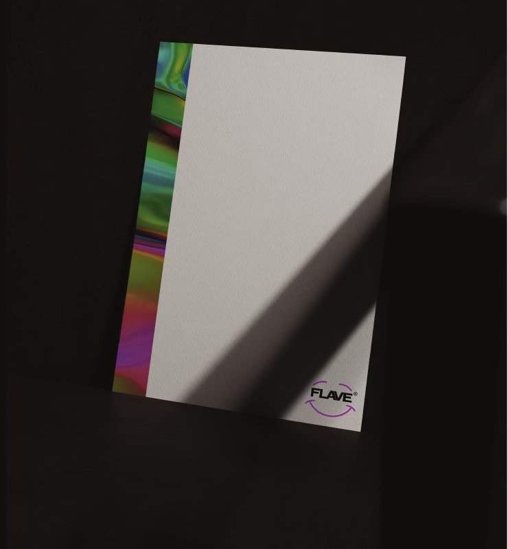
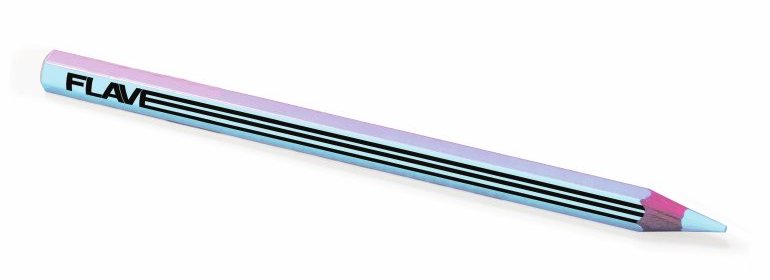
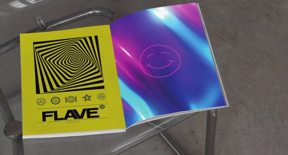
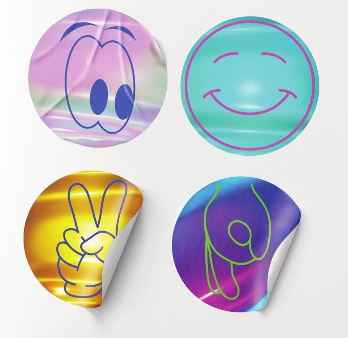
The identity was applied to a set of materials that show how far it stretches: letterhead, cards and sealed envelopes carrying the smiley symbol, print such as the magazine that sets a sharp black-and-yellow layout against pages of fluid gradient, and playful details such as the pencil and stickers.
What this means for your brand
A brand that speaks to its audience boldly needs a clear concept before any design: the idea that holds its parts together, the feeling it wants to leave, and how it stays coherent as it moves from a letterhead to a sticker to a printed piece. If you are founding an agency or a brand in entertainment and events, or reshaping one, the starting point is to write the concept first.
This work was executed at ThirtyThree Media and creatively directed within House of Idea, led by Mohammed Alhasoon.
Founding a brand in entertainment and events, or rebuilding one?Start with Concept Building: a document that settles the idea, name and personality before any design is commissioned.
Concept Building →