Building the visual identity of Kas Jebn, a Saudi cafeteria brand
Kas Jebn (Arabic for “cheese glass”) is a Saudi cafeteria brand that starts from a familiar memory: the cheese jar glass reused in homes, and the aluminium trays that carry food at gatherings. From that memory the idea, name and personality were built, followed by a brand guideline running from the logo to cups, bags, uniform and storefront.
 Concept · Identity
The idea
The brand starts from simple food culture in the Saudi home, where the reused cheese glass and the aluminium tray each had a story to tell: they fed rich and poor alike, and travelled between places. Kas Jebn lifts these vessels from kitchen tools to symbols of food that does not wait for an occasion, from the glass to the tray.
So the brand offers more than food and drink: it shows the culture that grew around them, from small buffets to subcultures and public spaces. Its aim is to embrace local traditions and raise them to a higher standard of quality and authenticity.
Name and logo
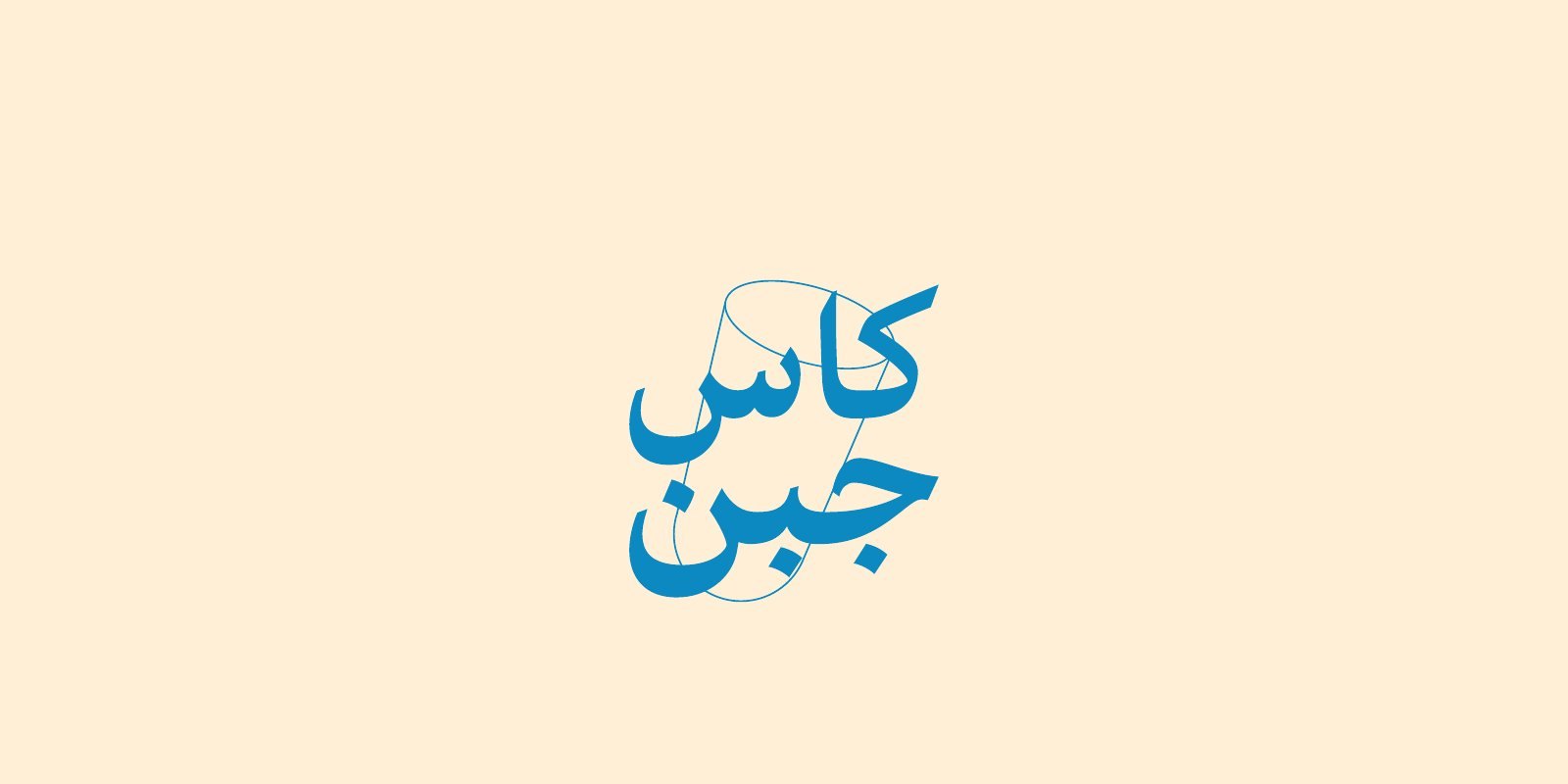
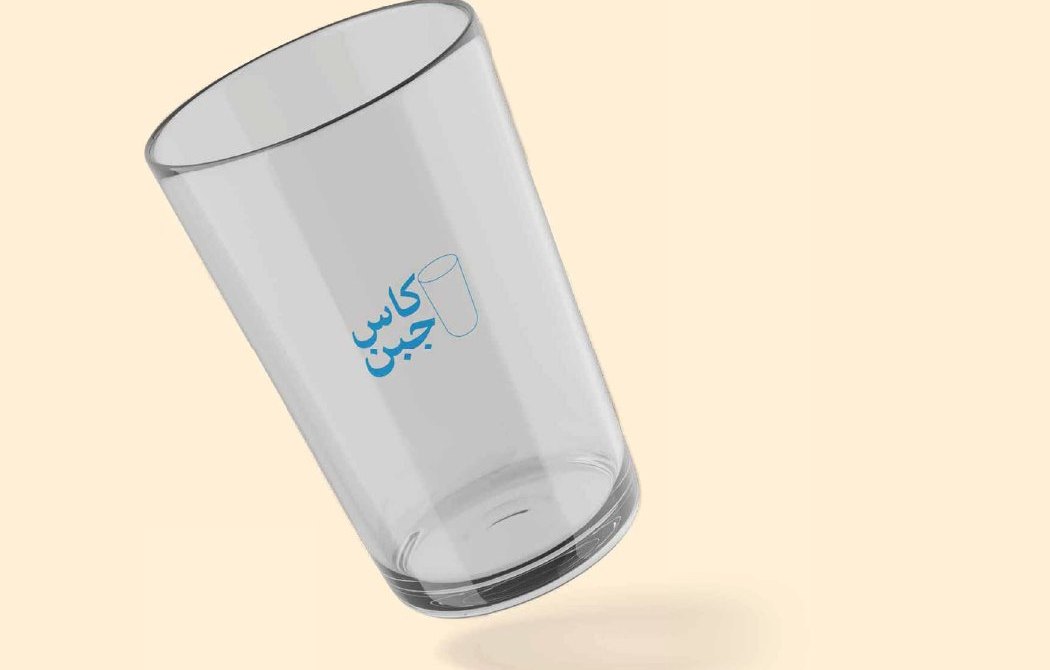
The name Kas Jebn comes from the glass that cheese was once packed in before returning to daily use. The logo pairs a heavy Arabic wordmark with a fine line drawing of a glass that intersects it, so the glass reads as part of the name rather than an add-on. The glass also works alone as a symbol or as a solid shape in the brand colour, and the wordmark has versions for light and blue backgrounds.
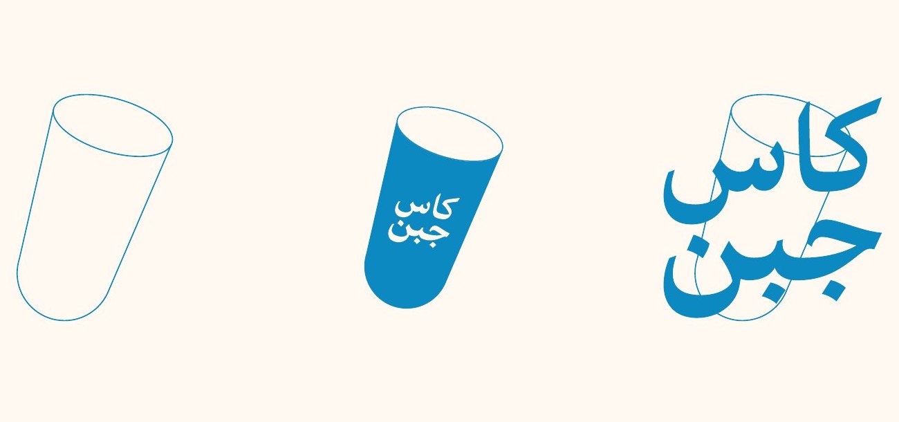
The glass was drawn on a measured geometric proportion, and a usage guide shows correct and incorrect application for whoever produces the printed pieces after handover.
Personality and tone
The tone is colloquial and lightly humorous, close to everyday speech and free of affectation. Its voice draws on a friendly comic sense that compares past and present, and carries messages through the brand and its social accounts with ease and no pretension. The brand also holds a stance: it respects its Saudi roots and upbringing while staying open to what the wider world offers.
Colour and type
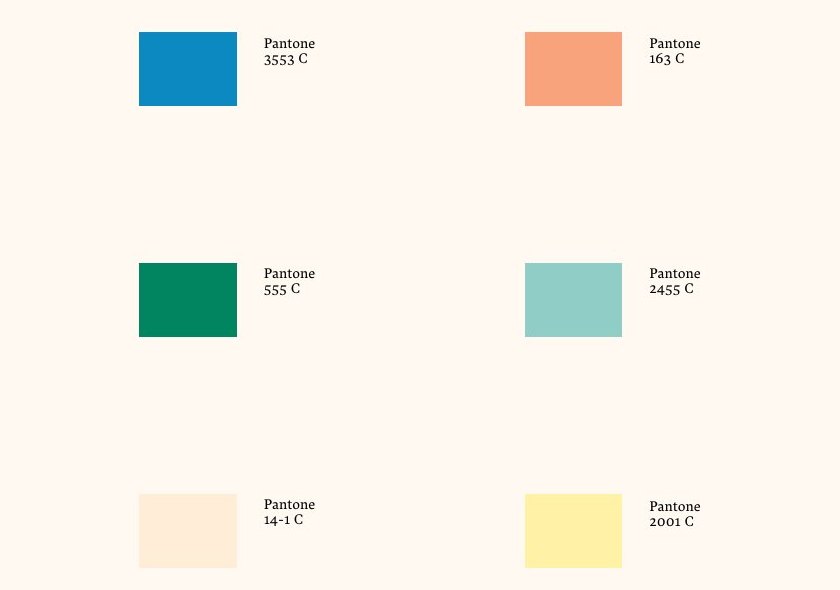
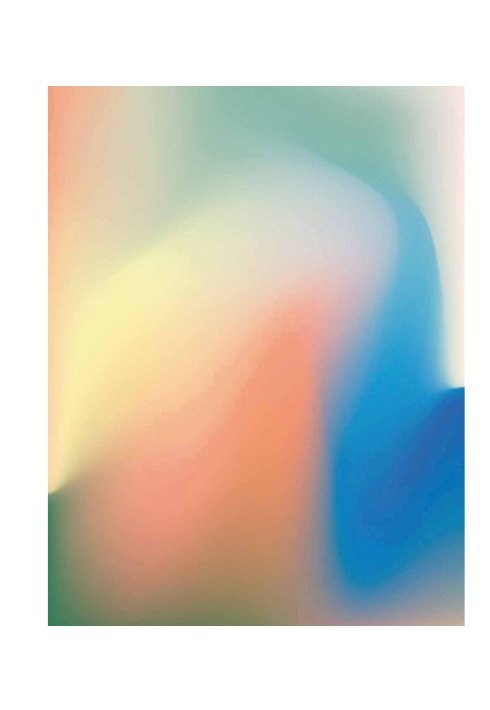
The palette rests on a vivid blue as the main brand colour, supported by a soft orange, a deep green and an aqua green, with warm beige and a quiet yellow as backgrounds. Colours are specified by Pantone reference so print stays consistent across materials, and they are also used as a blended gradient for feature backgrounds. The typeface is Harir in two weights, regular and bold.
Supporting symbols
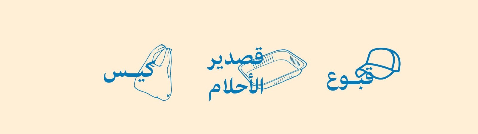
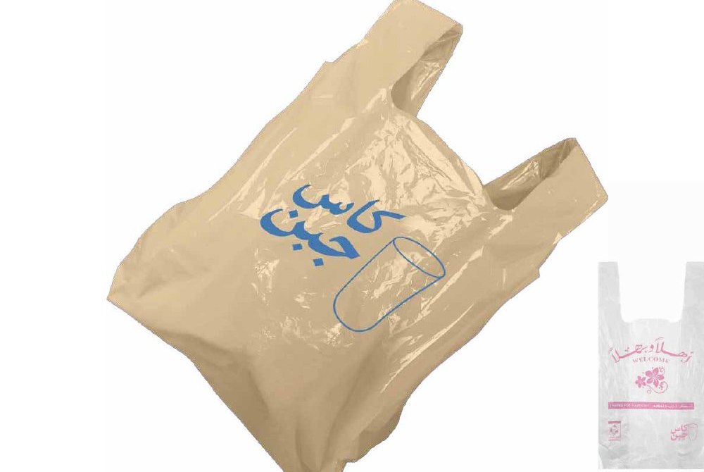
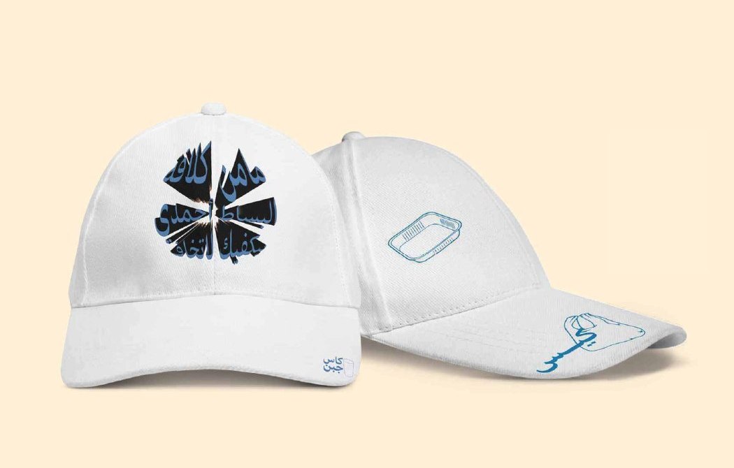
Beside the glass, each product or object gets a line drawing with a short Arabic word: “Qasdeer al-Ahlam” for the aluminium tray, “Qobou’” for the cap, and “Kees” for the plastic bag. The symbols work as one family and let the brand extend to new products without drifting from its language.
Applications
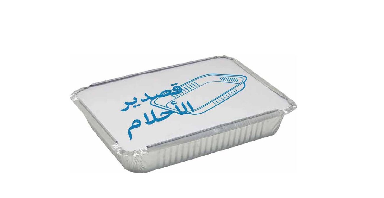
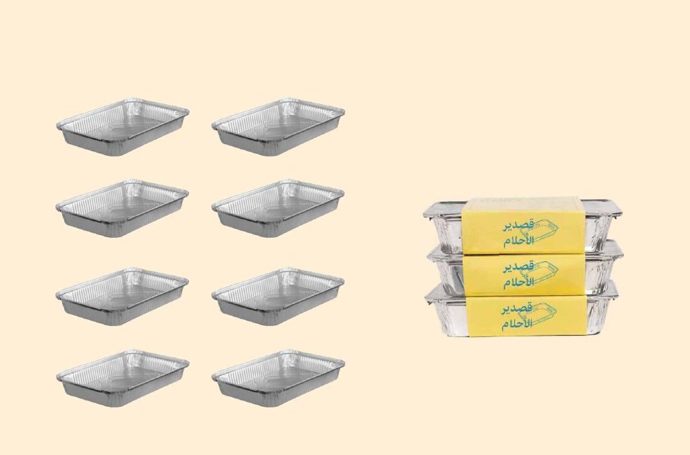
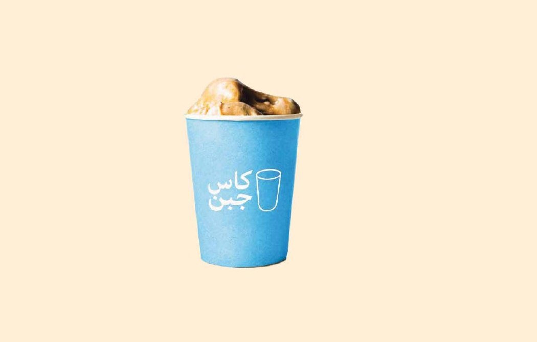
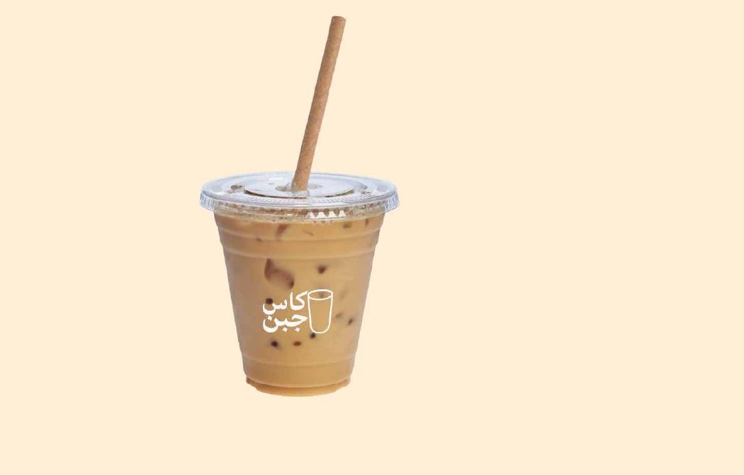
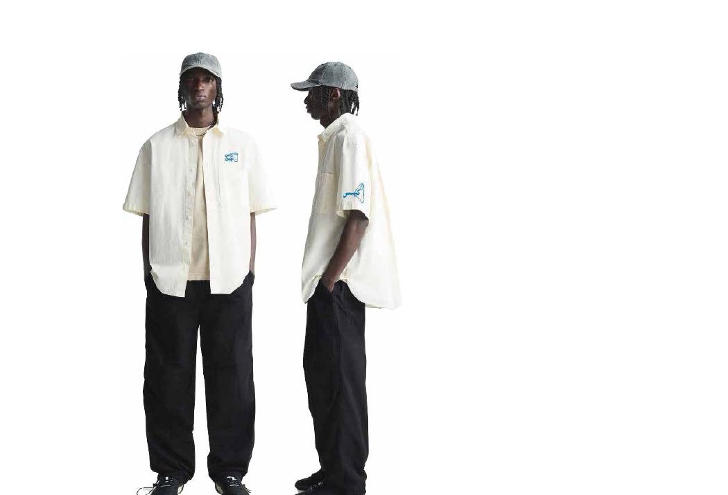
The identity was applied to the touchpoints a guest passes through: the glass tumbler, hot and cold drink cups, the aluminium tray bearing the brand mark, the bag, the cap and the team uniform.
Storefront and marketing
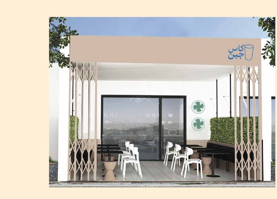
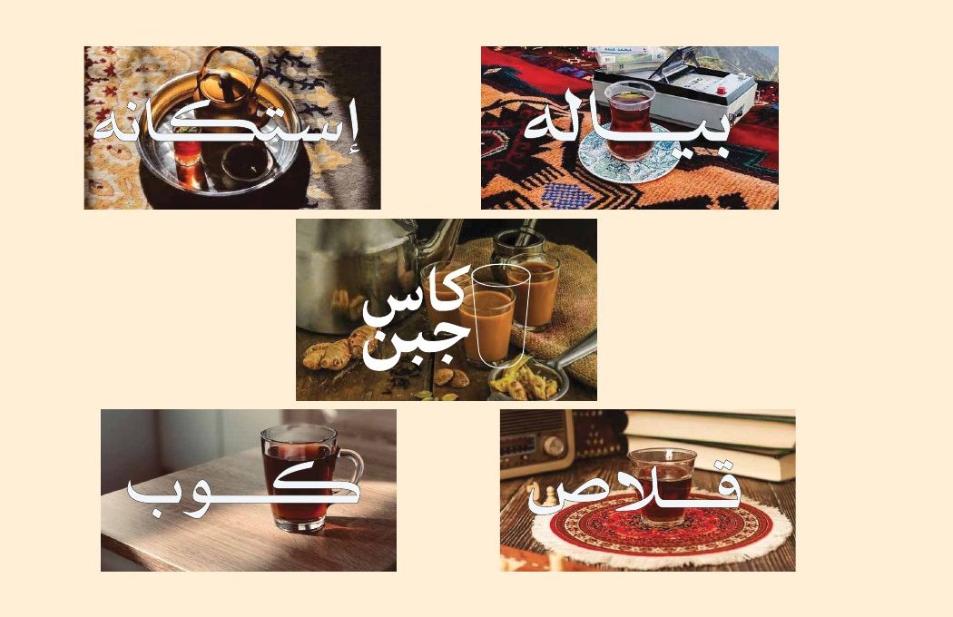
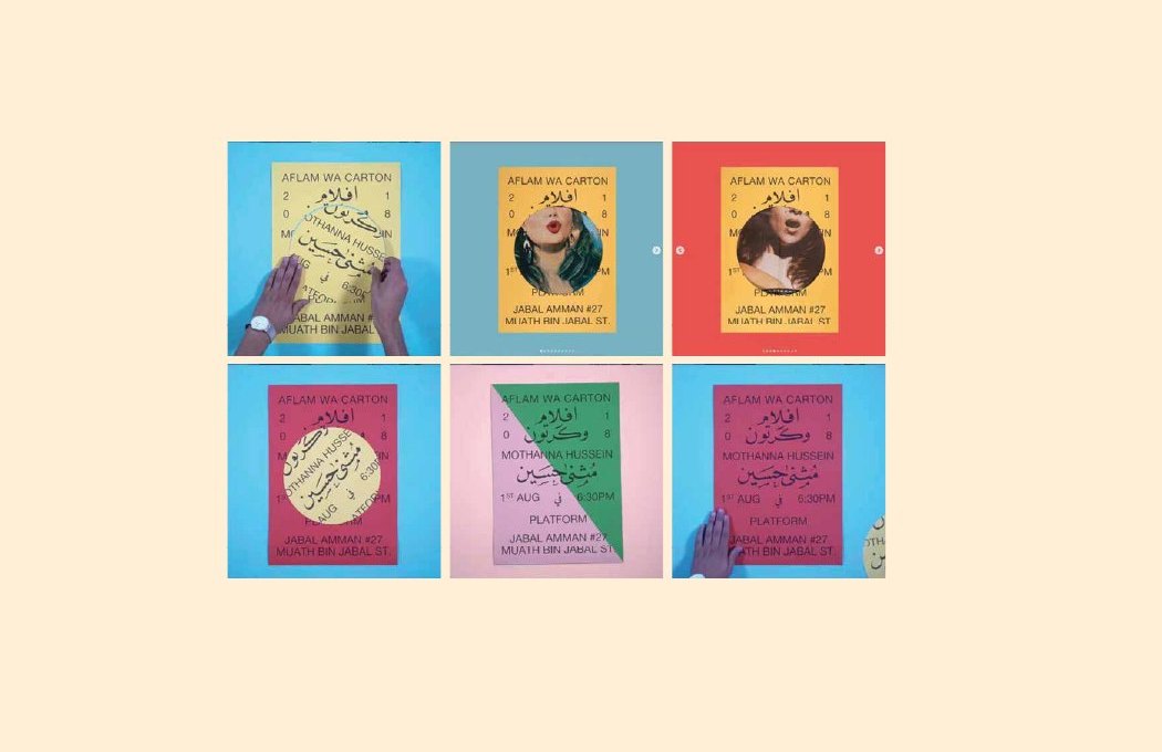
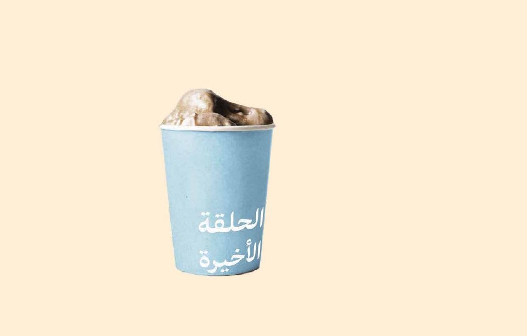
The identity extends to a storefront concept with an open canopy and timber screens echoing popular tea shops, and to marketing proposals: a launch campaign built on short sound-and-image clips, visual invitations echoing old cinema posters, and a seasonal product in its own cup.
What this means for your brand
A brand built on a real memory its audience already knows travels faster than one made from scratch with no story. That is why the work here began with the concept: where the name comes from, what tone it speaks in, and what it means to people before any logo is drawn. If you are opening a cafeteria or restaurant, or rebuilding an existing brand, the starting point is a concept document that settles the idea, name and personality, and everything that is printed and built rests on it.
The idea, concept and creative direction are by House of Idea, led by Mohammed Alhasoon. Visual execution and the brand guideline were produced by the ThirtyThree Media team.
Opening a cafeteria or rebuilding an existing brand?Start with Concept Building: a document that settles the idea, name and personality before any design is commissioned.
Concept Building →