Art direction and strategy guide for Maison Sociale’s social media content
When more than one person works on a single account, consistency becomes the first challenge. This reference guide for Maison Sociale unifies how the brand writes and how it appears, turning its overall taste into clear rules that any team member can apply to a post, a reel or an entire account grid.
 Art Direction · Strategy
The role of the guide
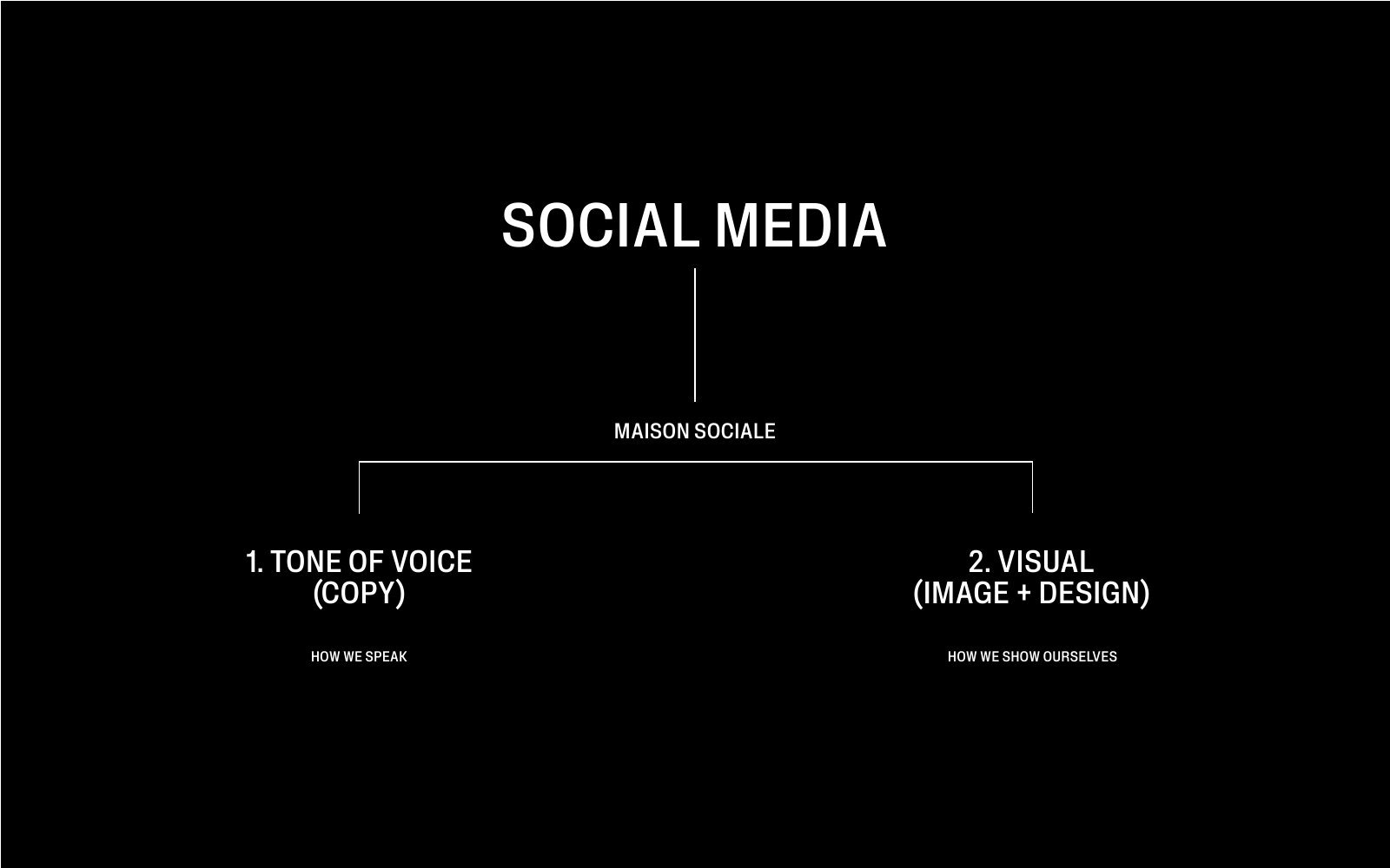
A premium brand quickly suffers from uneven execution: a photo with different lighting, copy in another tone, a template in an unapproved typeface, and the overall image weakens. The guide was therefore written as a single reference for everyone who produces content, inside the restaurant or outside it. It answers two questions on which everything else is built: how we speak, and how we appear.
The tone-of-voice system
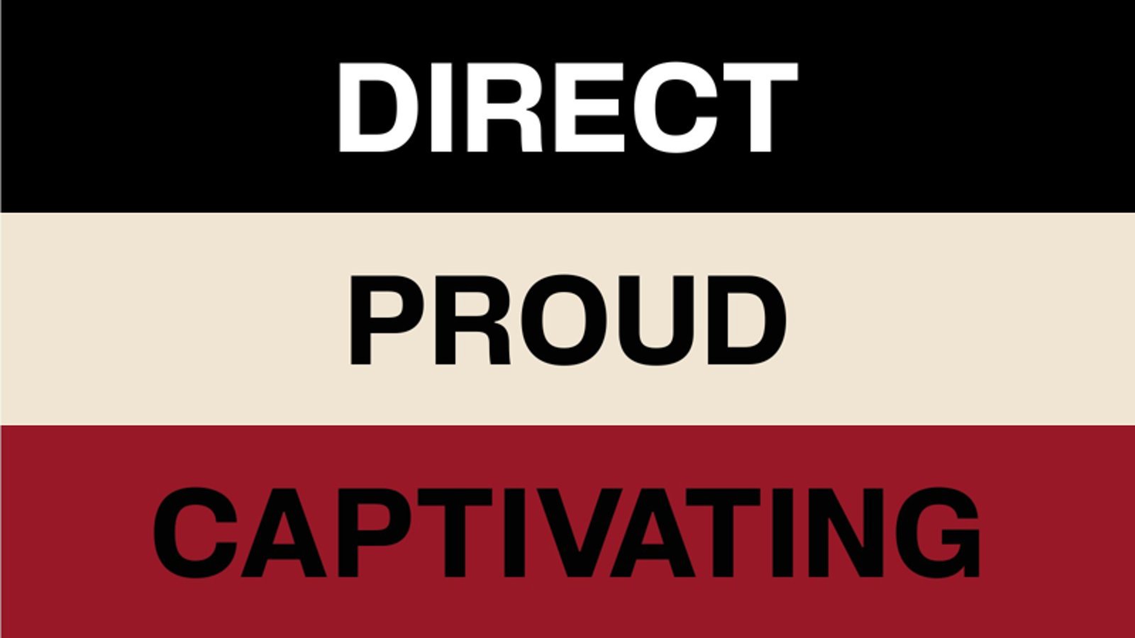
The brand’s tone is defined by three traits, each with a clear function in writing. The first is directness: organising ideas clearly and practically and anticipating what the guest needs, so information is easy to reach in the restaurant and online. The second is pride: expressing things with elegance and self-confidence, with real knowledge of the value of the product and service. The third is captivation: knowing the right moment for humour and engaging with occasions when that serves the brand.
The visual system
The guide divides visual tools into two parts: design, with its four elements (colour, logotype and monogram, fonts, and brand support marks), and then image and video with their categories. Each part rests on short, applicable rules, accompanied by correct and incorrect examples, because a wrong example shows the boundary faster than any explanation.
Colour
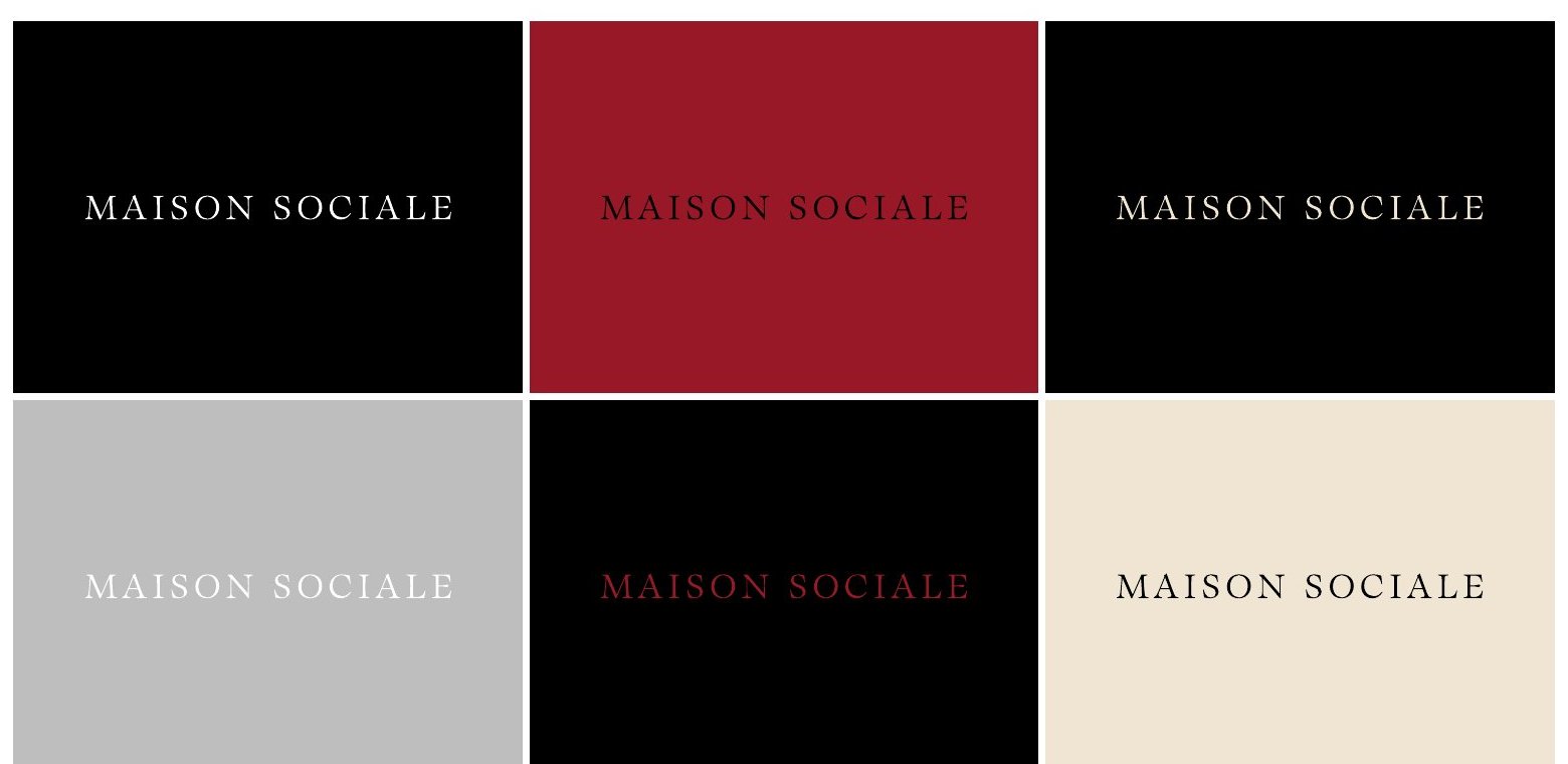
The palette has five colours: black, a warm bone, two light greys and a deep red specific to the brand. Short usage rules govern it: colour should come mainly from the photo and video themselves, no more than two solid colours are mixed in one piece, combinations with poor readability are avoided, and the red is used with black only. The general principle is restraint in colour, since calm here is part of the luxury.
Logotype, monogram and type
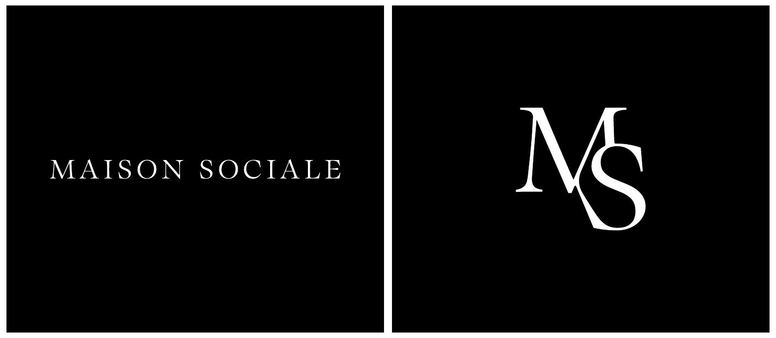
The wordmark and the monogram work as two separate units, each with its own place. The rules require enough breathing space around them, a size that is neither too small nor exaggerated, no use of both in the same piece, and a colour chosen to suit the background.
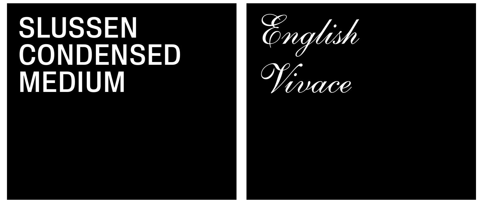
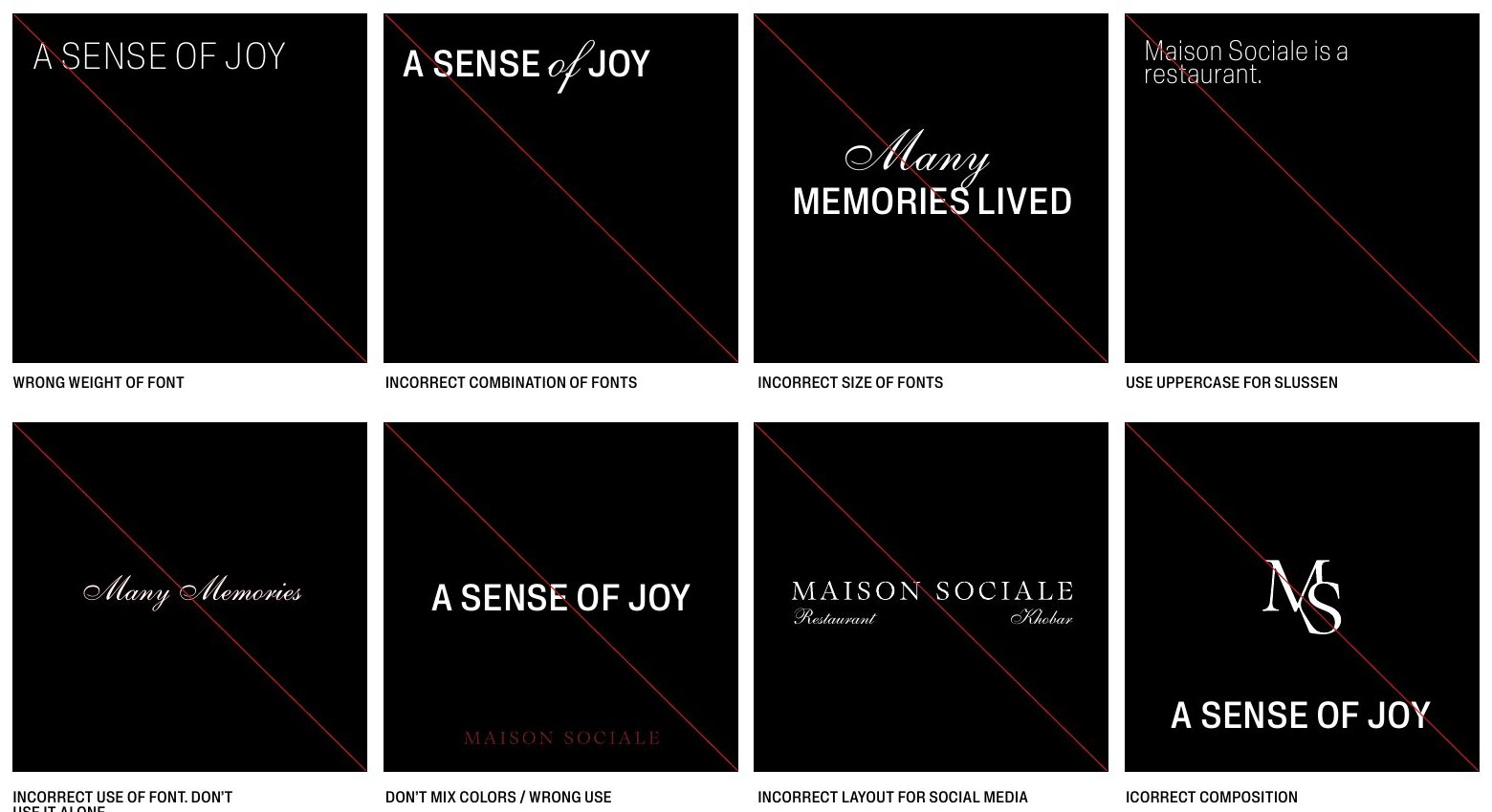
For type, a bold condensed grotesque is set for copy and titles in a single fixed weight, with a heavier version reserved for an occasional large title that needs contrast. A decorative script is added in very rare cases for a special touch, with the warning that overuse spoils a composition. The guide shows common misuse openly, such as choosing an unapproved weight, mixing typefaces or scaling them out of proportion.
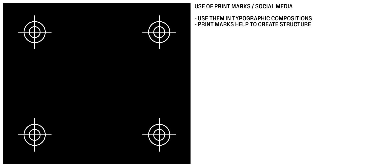
Brand support also includes fine print marks, the registration symbols placed at the corners of a layout, which are used in typographic compositions to give the space structure and rhythm.
Content categories
The guide sets nine content categories to keep the visual flow coherent: food images, interior and exterior, action reels, brand values and vision, kitchen details, team and partners, inspiration and details, statements and announcements, and a general category for occasions. Each has its purpose and way of being shot, since photographing a dish differs from photographing a space or a team. One fixed rule is that reels close with the logotype and carry it on the cover.
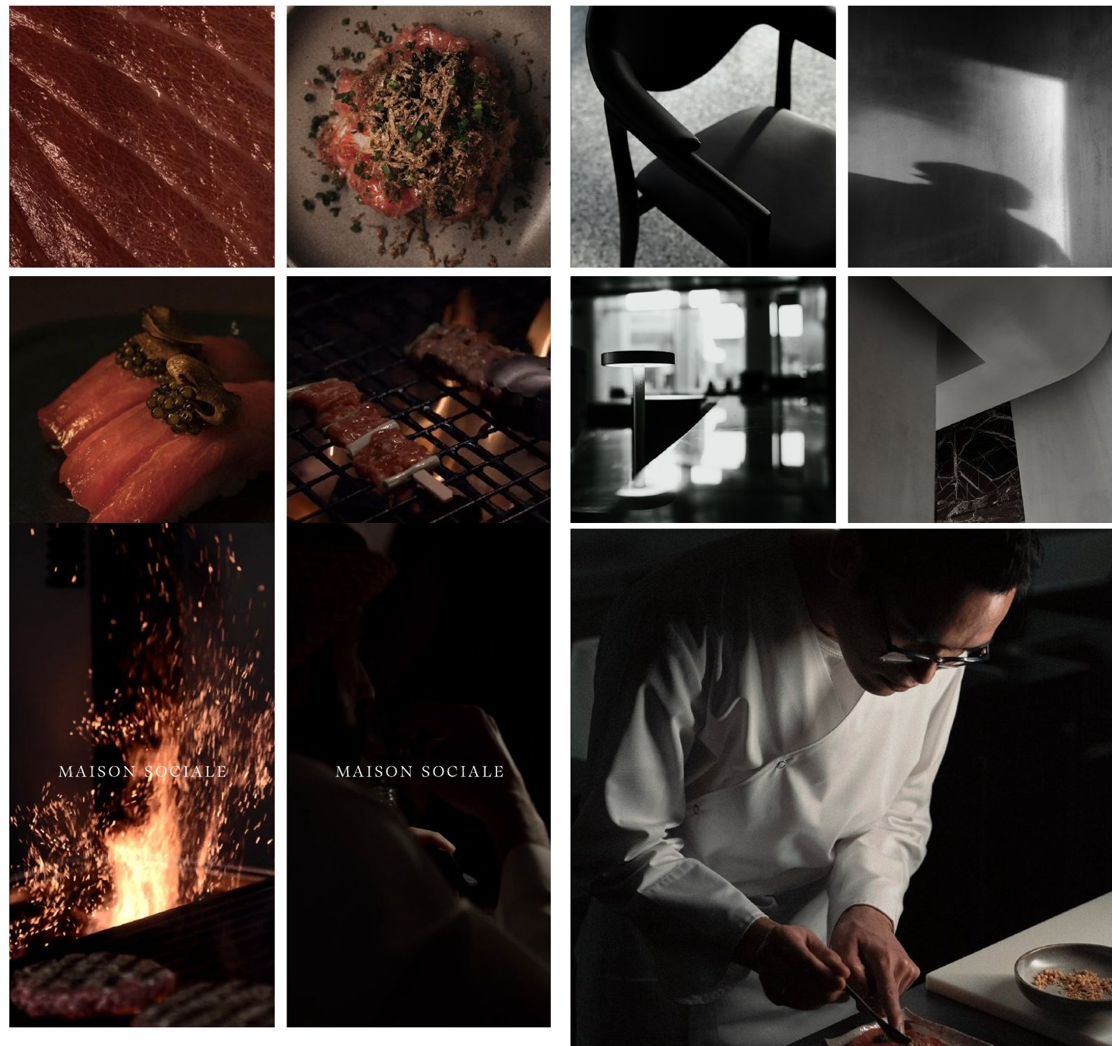
Image direction and the account grid
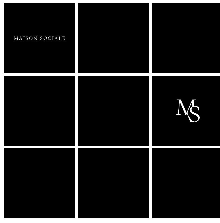
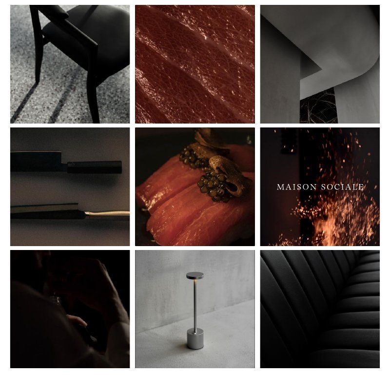
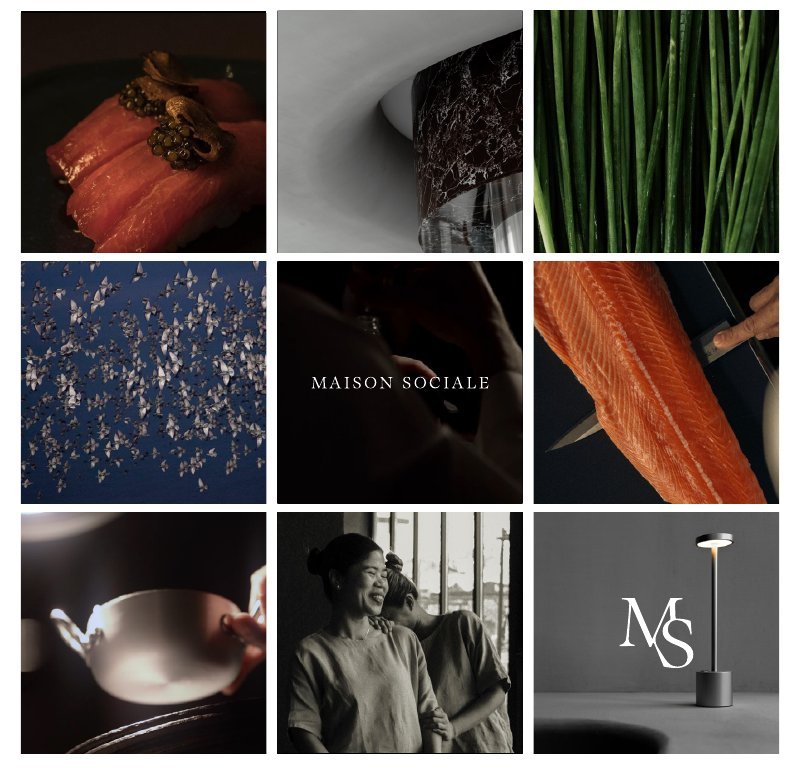
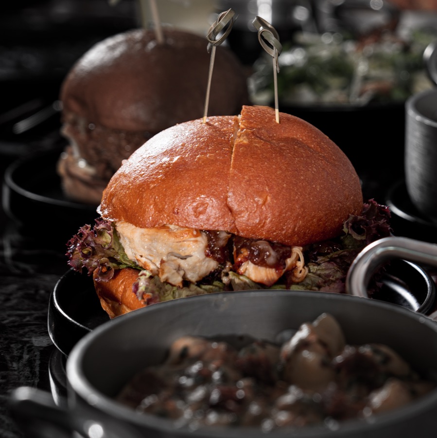
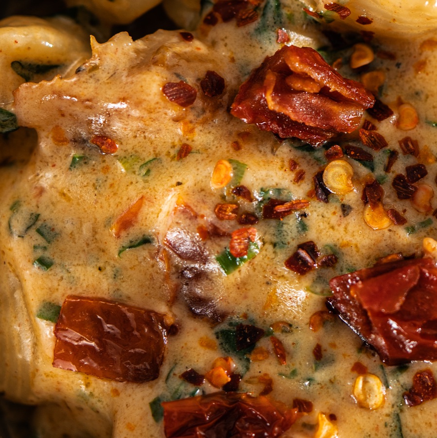
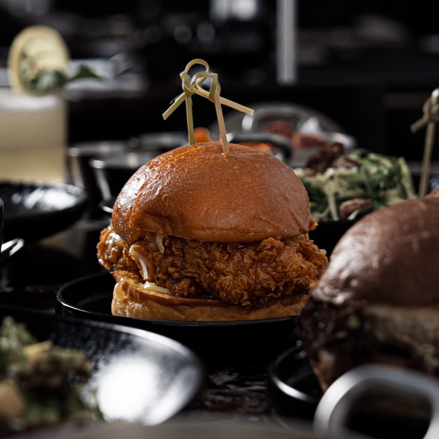
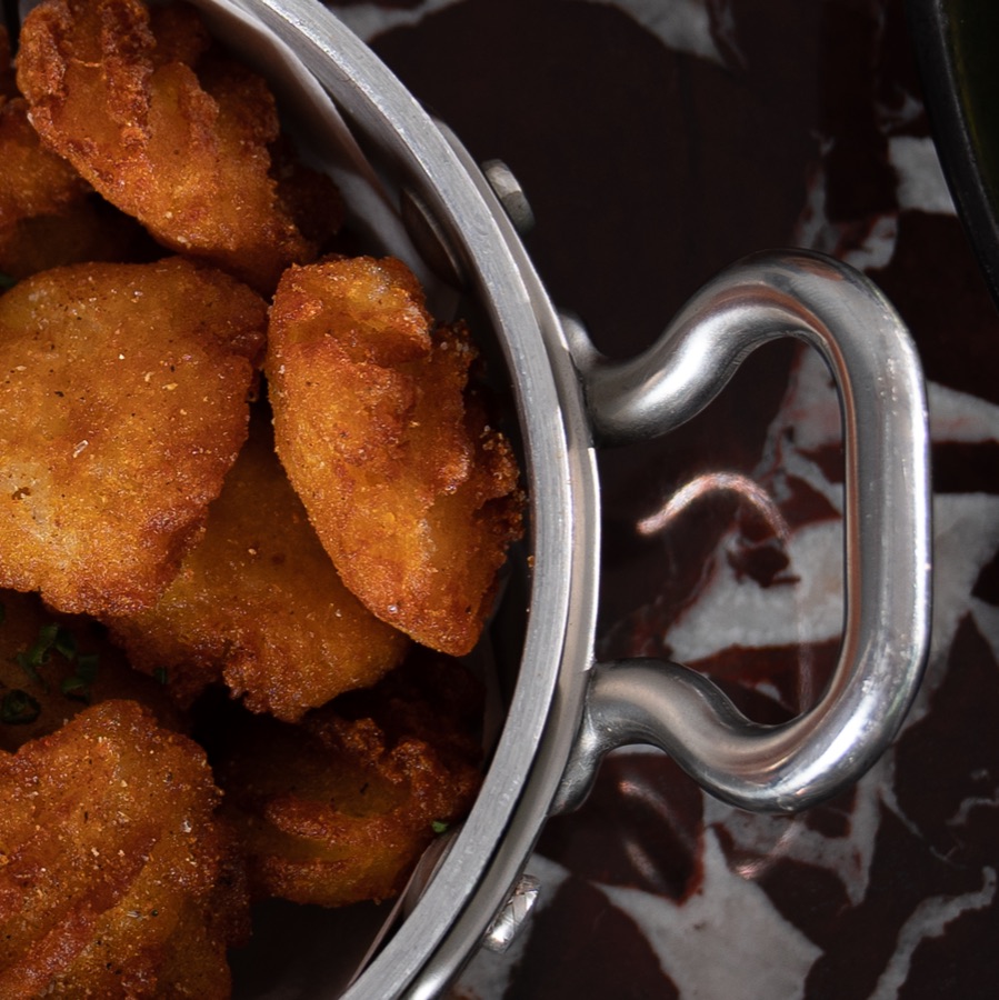
Image direction is set by clear rules: minimal composition and colour, low exposure, one colour or texture for backgrounds, a centred main element, and a balance between images so the grid looks neither dull, repetitive nor chaotic. The Instagram grid is treated as one unit: the share of pieces carrying graphics is capped, and the photographs are left to speak for themselves rather than burdened with branding. Reference grids in the guide show the team the intended balance across categories.
Samples of the visual direction
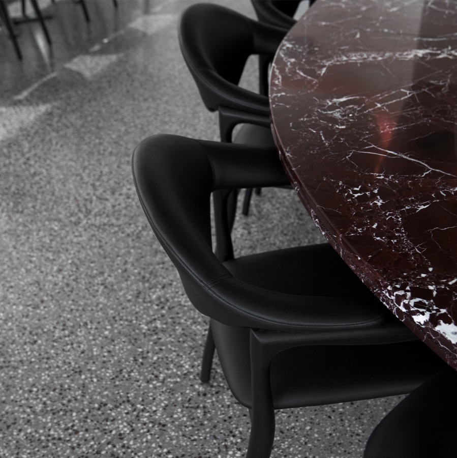
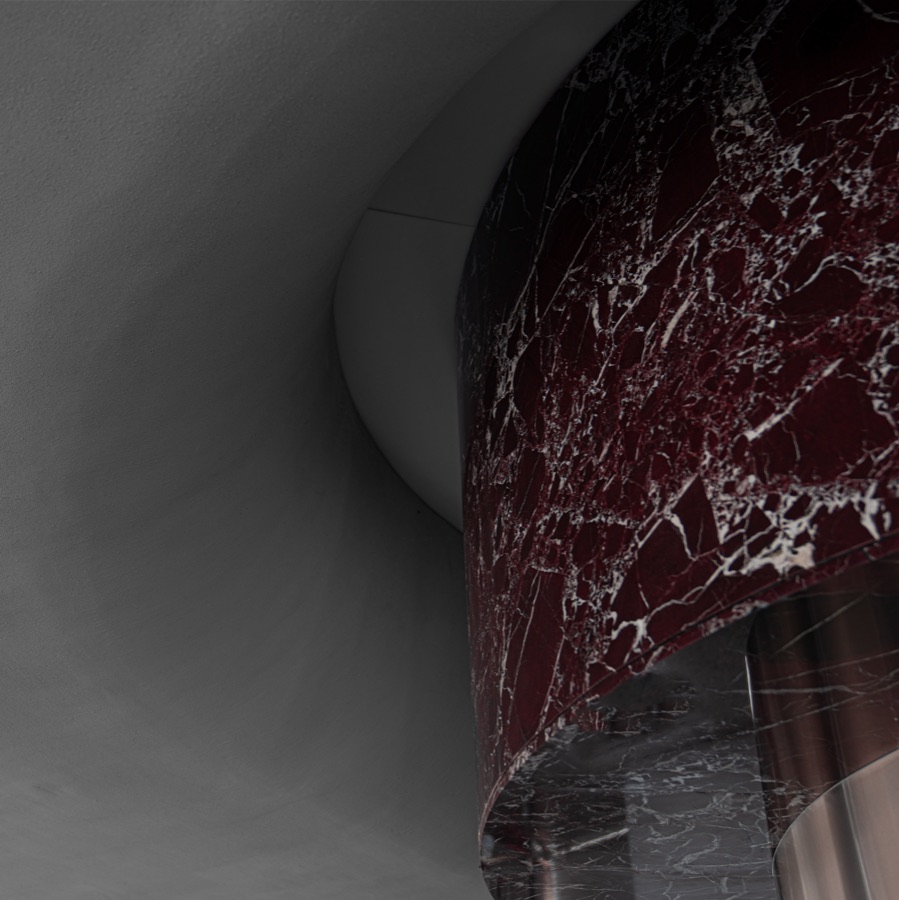
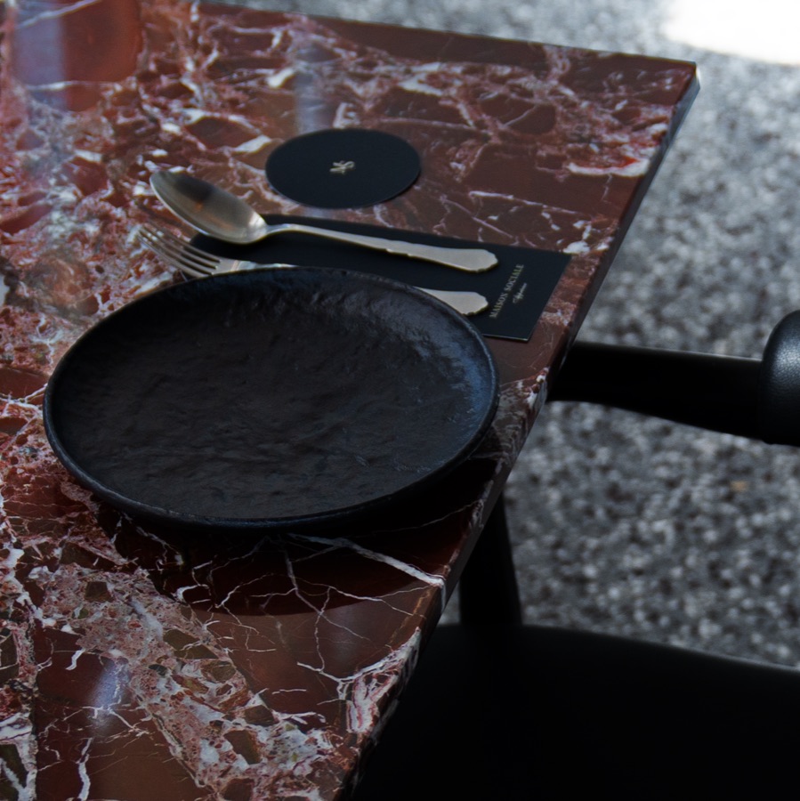
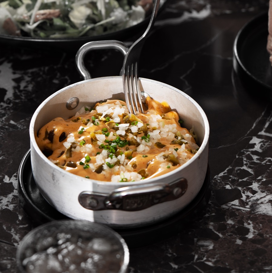
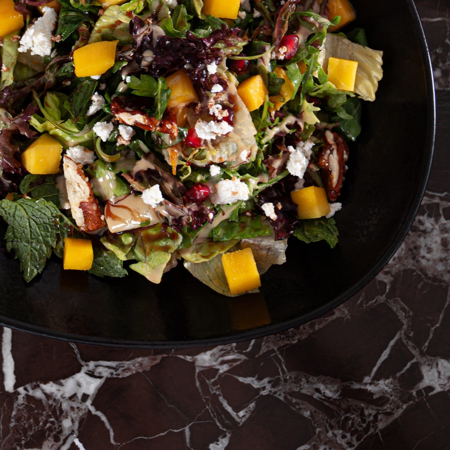
Twelve images from the content’s visual direction reference: low-key light, close compositions and a restrained palette that govern every post.


What this means for your brand
Social teams change, executors rotate, and the brand account remains. A good guide ensures that content looks the same a year from now as it does today, whether an in-house team or an agency produces it. If your brand publishes on social media without a written reference, the starting point is the concept: what the brand’s personality is, how it speaks, and what it never does.
Art direction and authorship of the guide by Mohammed Alhasoon as art director, under House of Idea. The original guide does not name an execution agency, so none is credited here. The guide is an internal brand document, so this page shows its method, structure and visual pages only.

Publishing on social media without a written reference?Start with Concept Building: a document that settles personality, tone and visual system before any posts are produced.
Concept Building →