The “Ratab Fell” (طاح الرطب) Seasonal Campaign for OLS
How a long-established local season in the Eastern Province became a campaign with its own name, identity, sound and product, with the opening reel passing 135K views without paid media, more than 92% of them from outside the brand’s audience. A case study in building a complete campaign concept.
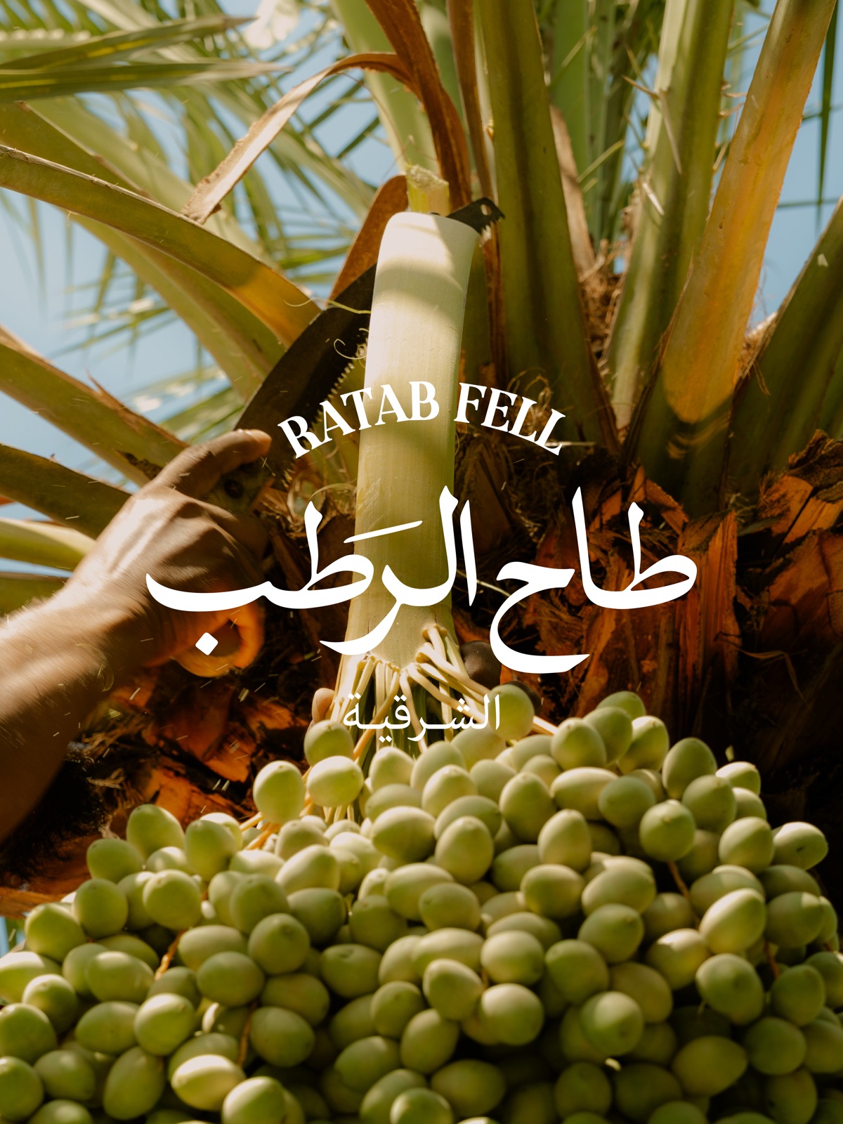 Ratab Edition
Context
The dates season in the Eastern Province is not only an agricultural event; it is part of the memory of the place: the palms of Al-Ahsa, the stages of ripening from green to honey-brown, and the phrase people repeat when the first ratab reaches the house. A contemporary salad brand like OLS faces a simple, difficult question each summer: how does it enter this season without looking like an outsider, and without settling for a seasonal offer forgotten by the end of its week?
Insight
The observation the campaign was built on: heritage is not consumed by re-presenting it as it is, but by taking it seriously as an ingredient. In Saudi cuisine, ratab is usually served in its familiar form, with coffee or as a dessert. The moment it becomes an ingredient in a savoury, crunchy dish, from a brand nobody expects it from, is the moment that stops the audience.
The idea: “Ratab Fell”
The name is the very phrase the people of the Eastern Province use to announce the arrival of the season. Choosing it over an invented name gave the campaign three advantages at once: familiar on first hearing, local without pretension, and translatable into Ratab Fell in a second language while keeping the same strangeness that makes it memorable. Alongside it, a short line fixes the place: “The Eastern Province”.
Identity
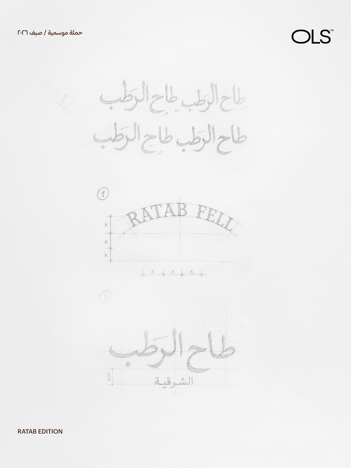
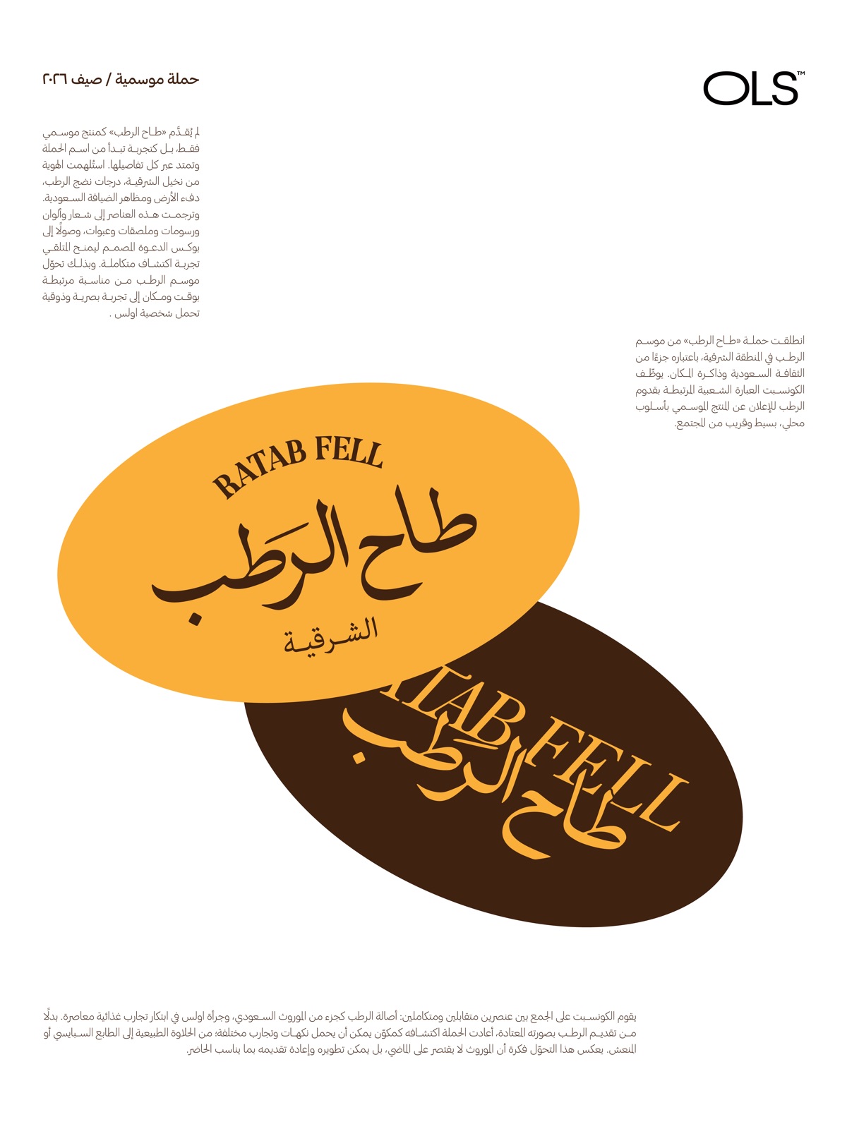
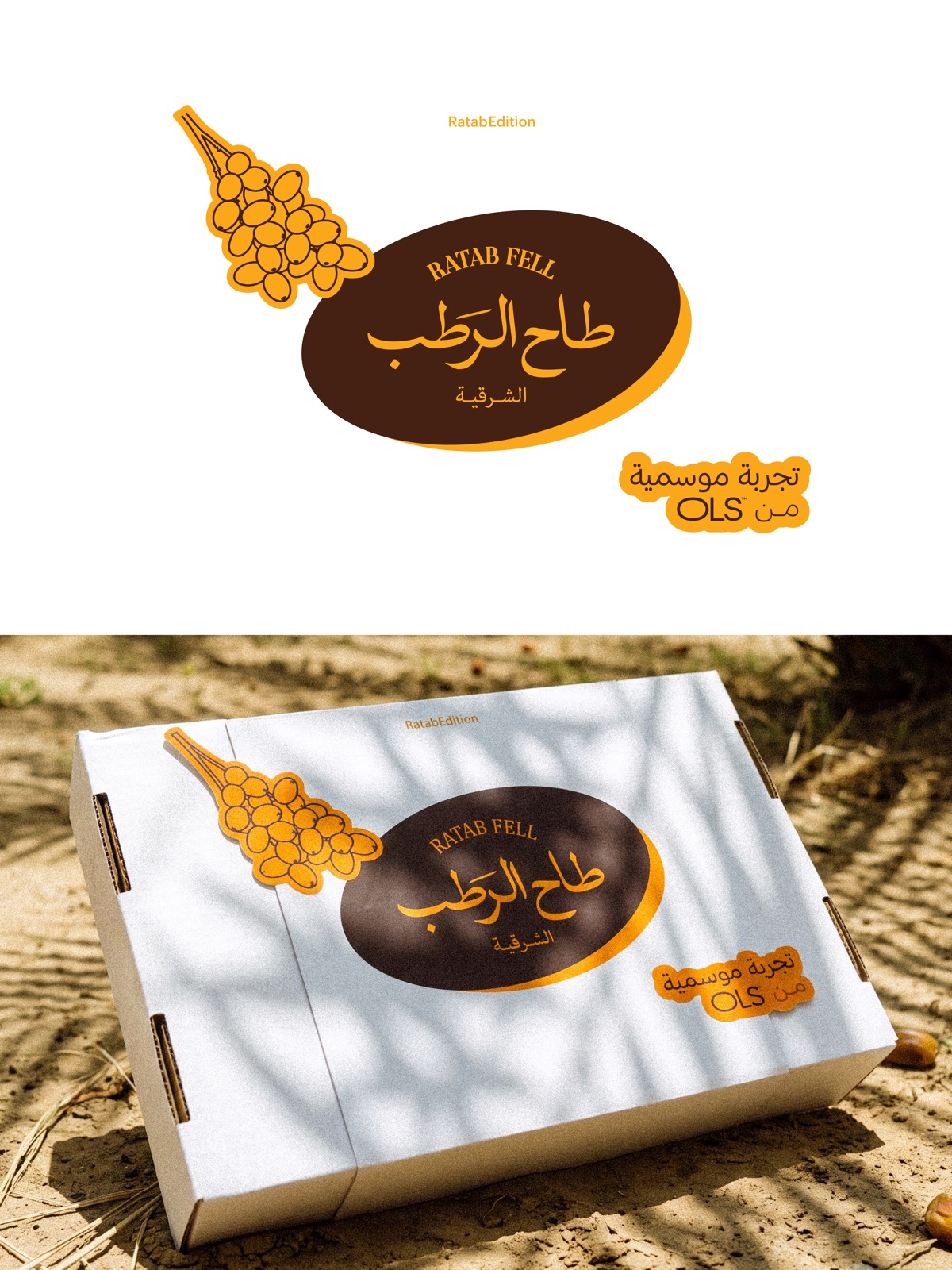
The colours were drawn from the ratab itself: ripe honey on deep brown. The Arabic lettering was drawn by hand before being digitised, and the English name was set on an arc echoing a palm frond. The frond illustration became a sticker repeated across boxes, jars and posts, so the identity could be recognised from a single element and from a distance.
The story before the product
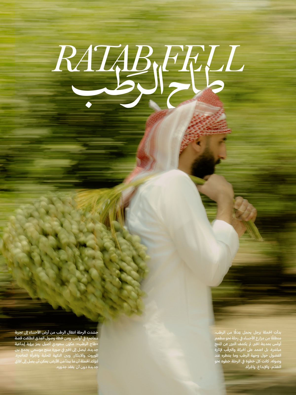
The launch did not open with a shot of the dish, but with a man carrying a bunch of Al-Ahsa ratab on his way to Khobar. The teaser relied on movement and anticipation rather than direct announcement, so followers wondered about the destination before they knew the product. When the bunch arrived, the name arrived with it.
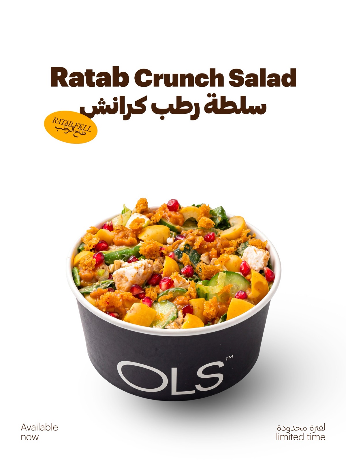
The product: Ratab Crunch Salad
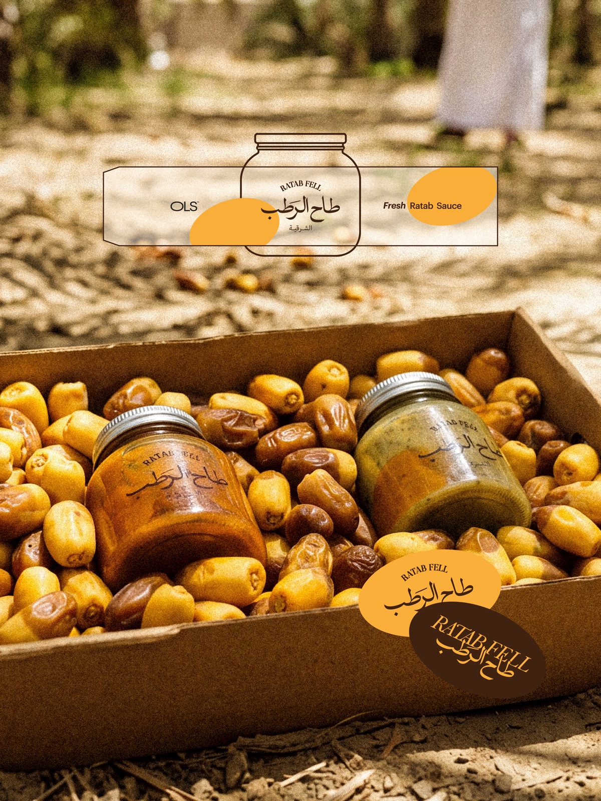
The hardest decision in the campaign was not visual but in the kitchen: how does ratab enter a savoury dish? The recipe was built on contrast: the natural sweetness of the ratab against crunch, the tartness of pomegranate, the coolness of cucumber and the saltiness of cheese. A limited-time product priced to reflect its value, accompanied by two jars of fresh ratab sauce so the experience extends into the customer’s home.
The box
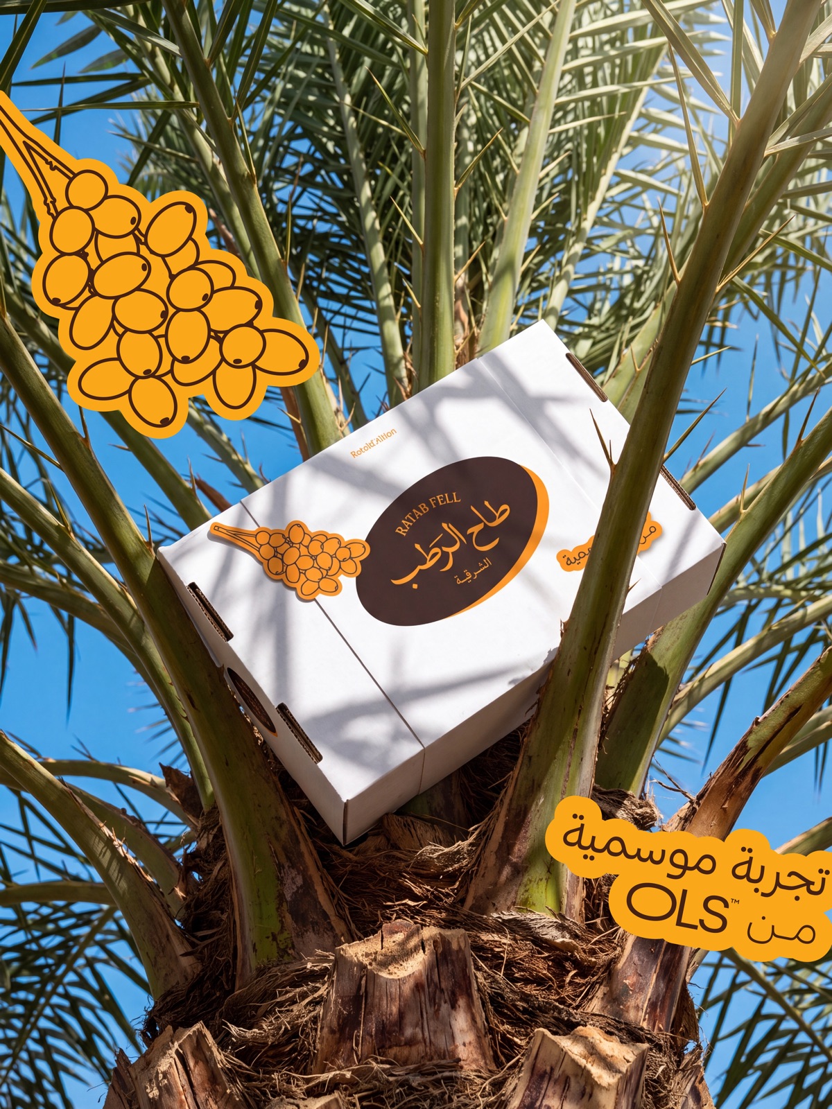
An invitation box designed to be opened on camera: raw white paper, the honey-coloured sticker and the drawn frond. It was sent to opinion leaders and content creators in the Eastern Province, so that opening the box became the announcement.
Sound
The choice of music was part of the concept, not a decorative addition: a local rhythm recognisable from its first second, tying the campaign to the place before a single word is read.
The campaign as published
Watch the campaign on Instagram →
Results
Figures for the opening reel on Instagram, with no paid media. The most important indicator is not the view count but the share of non-followers: more than 92% of viewers were not part of the brand’s audience, meaning the idea spread on its own.
Source: Instagram insights for the opening reel, October 2026.
What this means for your brand
Your brand’s next season may be Ramadan, summer, a branch opening or a product launch. The difference between an offer that is forgotten and a campaign that is remembered is the method whose traces appear on this page: a name the audience owns before the brand does, an identity recognised from a single element, a sound that ties it to the place, and a product that turns the idea into an experience to be tasted, photographed and shared. This is what the “Concept Building” package delivers: half a day with your team, closing with the concept document and launch plan, for you to execute with your team or with a team recommended to you.
Creative leadership and campaign concept: Mohammed Alhasoon, covering the campaign name, the visual direction, the choice of music, and the idea of the accompanying product, which was developed with the restaurant’s kitchen team. Photography and design: ThirtyThree Media Group. Identity, packaging and launch: House of Idea. What appears on this page is the combined work of this team.
Does your brand have a season or occasion worth owning?Start with a free 10-minute call to determine whether your campaign needs a full concept or a smaller step.
Book Concept Building →Or a free call