Building the concept and identity of OLS, a healthy-eating restaurant
Healthy restaurants are many, but few combine health, a fair price and sustainability in a single experience. OLS, short for Our Life Style, was built from scratch: idea, concept, identity, menu and pricing, followed by a brand book covering the logo, colour, type and their applications from the bowl to the uniform.
 Concept · Identity
The idea
The brand rests on the belief that healthy eating should be within everyone’s reach without giving up taste or quality. That produced four pillars: balance, sustainability, quality and an affordable price. The brand sums them up in short lines used on signage and packaging, among them “Balanced, healthy living at an affordable price” and “Where healthy eating meets sustainability and quality.”
The idea translates into a clear operating model: guests compose their own meal from fresh proteins and vegetables, weekly and monthly subscriptions are available for those who want routine, and a grab-and-go fridge serves the quick need.
Name and logo
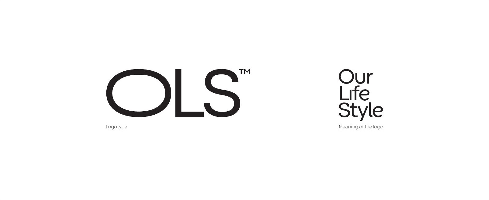
“OLS” is a short name that is easy to read and remember, and its meaning sits in a plain phrase: Our Life Style. The logo is a wordmark in wide, heavy letters, with the full name set beside it in stacked lines to explain the meaning wherever there is room.
Personality and tone
The brand’s personality was defined as committed to health, modern, precise in detail, and caring toward its guest without preaching. The tone is confident, supportive and uplifting, friendly and approachable in every message. Four values govern it: sustainability, quality, health and inclusiveness.
The signature visual element
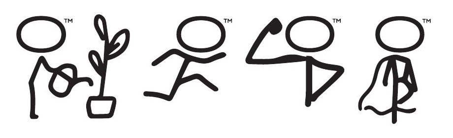
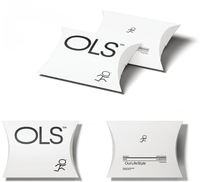
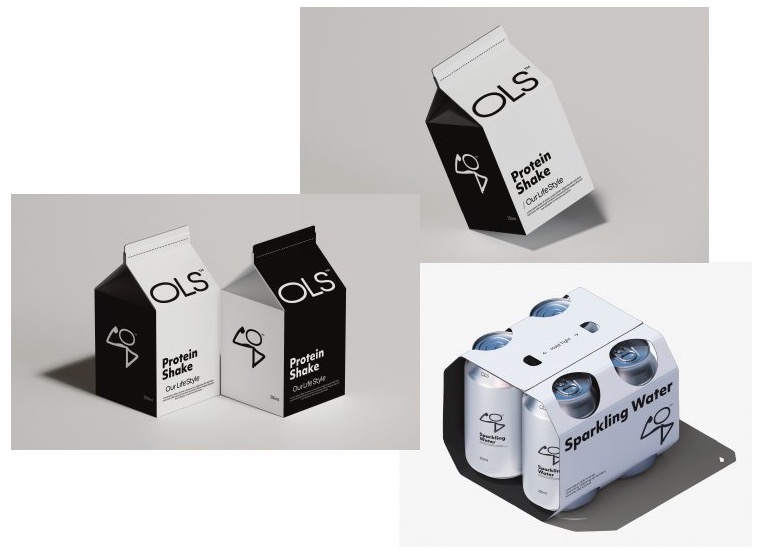
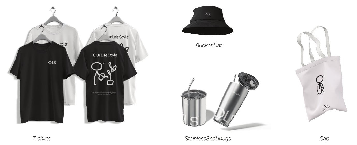
The identity centres on the letter “O”, which does two jobs: it is the first letter of the name, and it is the head of a line character performing everyday activities such as watering a plant, running and lifting. The identity thus becomes a world of scenes rather than a static mark, one that can be renewed on packaging and apparel without losing coherence. The same oval later became the bowl in which food is served.
Colour, type and icons
The palette rests on a neutral base of white, light grey and soft black, supported by natural colours drawn from the food itself: green, beige and earthy brown, with three vibrant accents of orange, red and yellow. White is the dominant surface so the dish is seen before anything else.
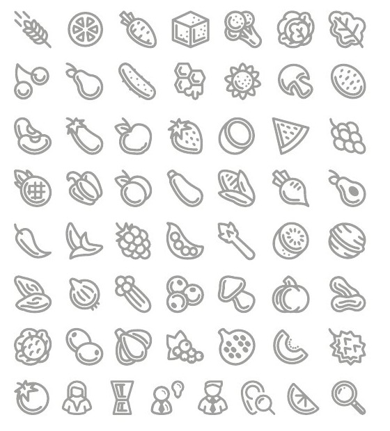
The typeface is Aktiv Grotesk in its Latin and Arabic versions, so reading stays consistent across both languages. A set of line icons for ingredients, from grains and vegetables to fruit, supports flexible patterns and visual menus.
Menu and pricing
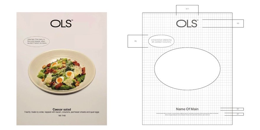
The menu was designed around customisation: dishes and ingredients the guest assembles, and a price structure that keeps healthy eating within reach of a wide audience, alongside weekly and monthly subscription plans for those who want commitment. A fixed display template was set for each item: the dish inside the oval, its name, a short description and its price, in measured proportions so every menu and post stays on one pattern.
Applications
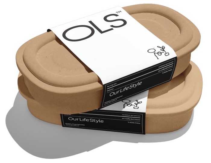
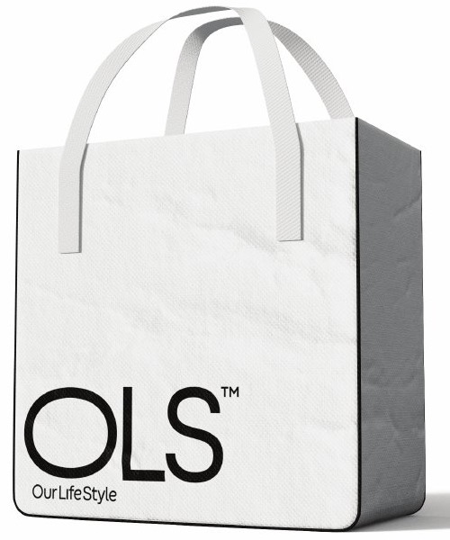
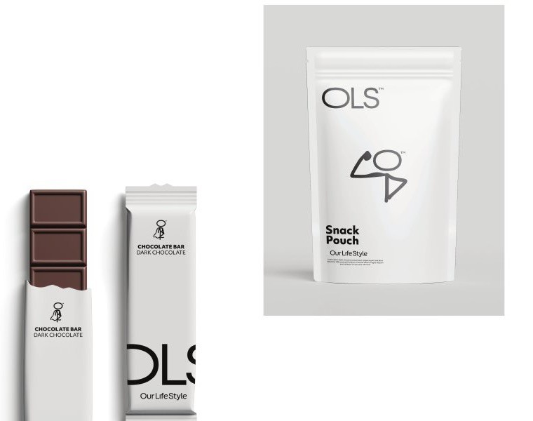
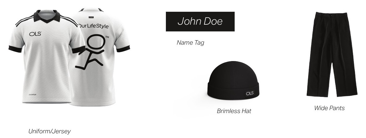
The identity was tested at every touchpoint a guest passes through: the oval bowl in which the food is served, the takeaway bag lined with a silver layer to keep food warm, grab-and-go packs, the team uniform, and brand merchandise.
What this means for your brand
A good identity is measured by its ability to travel from the logo to the bowl, the bag and the uniform without changing, and by how clearly its rules are written for whoever prints and builds it after you. That is why the work included a full brand book with safe zones, usage sizes and examples of incorrect use. If you are opening a restaurant or rebuilding an existing brand, the starting point is the concept: who the meal is for, at what price, and with what personality.
The idea, concept, creative direction, menu and pricing are by House of Idea, led by Mohammed Alhasoon. Visual execution and the brand book were produced by the ThirtyThree Media team. The brand’s seasonal “Ratab Fell” campaign has its own case study.
Opening a restaurant or rebuilding an existing brand?Start with Concept Building: a document that settles the idea, name, personality and pricing before any design is commissioned.
Concept Building →